He was learning to care for his father while trying to understand what had happened.
The first problem was not a missing app. It was a family trying to find its footing after a stroke.
He called me after becoming deeply involved in his father's care. He described searching for guidance through intensive care, the period after the ICU, discharge, and life back at home — trying to understand both the care journey and how the US healthcare system worked around it. He wanted to know what his father needed that day, what the doctor had actually said, and what the next person should know when he stepped away to rest.
He found pieces of information, but no single experience that connected understanding, recovery routines and the people sharing responsibility. So he began writing his own notes for the next doctor, nurse or relative.
The CDC reports more than 795,000 strokes each year in the United States — roughly 610,000 first or new strokes and 185,000 recurrent ones. But the statistic was not the reason to build. The reason was a father, a son, and the everyday uncertainty of what to do next.
His experience gave the work its purpose. I joined as Lead Product Designer to turn that uncertainty into something people could understand and use, whether they were recovering from a stroke or helping someone who was.
The next person taking over care should not have to reconstruct the story from memory.
We started with eight ideas. Caregivers wanted one answer.
Our first instinct was to design specialised solutions for different parts of the stroke journey. Stroke Technology began by exploring an ecosystem of separate apps, each with a plausible role: billing, emergency support, food, home life, communication, shopping, hand therapy and broader recovery support. I led design and content across the whole family.
Then we put those ideas in front of survivors and caregivers. As we introduced each next app, we kept hearing a version of the same three questions: what's this one for again? What does it do? How do we navigate them?
That was a difficult signal, and a useful one. The structure made perfect sense from the business side — one application per service. It did not match how a caregiver experiences stroke recovery. People were not thinking in product lines. They were trying to help someone eat, take medication, practise speech and get safely through a day.
So we reframed it: keep the specialist capabilities, but make the main recovery journey reachable from one central experience. HealStroke became that home. This was a product-architecture decision long before it became a screen-design decision, and it is the one I would defend first.
Less separation between products, and less navigation for a family already carrying enough. We gave up clean product boundaries to buy a single place to begin.
- 01
Eight specialised products
Stroke Bill, Stroke Siren, Stroke Food, HealStroke, HomeStroke, Aphasay, Stroke Shopping and HandTherapy — one app per service, clean from the business side.
- 02
One understandable daily experience
HealStroke as the central place for everyday recovery and caregiving, with specialist needs folded into a structure a tired person could navigate.
A caregiver shouldn't have to become an expert in eight apps just to know what matters next.
We stopped treating stroke statistics like a user profile.
Population research helped us understand the breadth of stroke. But stroke type, age and broad clinical categories could not tell us how one person communicated, moved or managed a meal today.
So we interviewed survivors and caregivers and asked them to retrace the journey: the first signs, the symptoms that followed, what changed during care, how eating and drinking were affected, which activities became part of recovery, and what information caregivers found themselves repeating. We checked those accounts against reputable stroke and rehabilitation sources to separate common patterns from needs that varied person to person.
The design lesson was not to build a different app for each diagnosis. It was to let someone describe their present needs and build the experience around that reality. Setup explored affected body areas, mobility, memory, communication and swallowing, so the right activities and guidance could surface without forcing everyone down the same path.
Let the person tell the app what matters
Early setup explored movement, thinking and swallowing needs as inputs to a more relevant experience. Pause the motion, or select any screen to enlarge it.
We weren't trying to guess who someone was from their stroke category. We wanted to understand what they could do today.
A useful care plan has to work on an ordinary Tuesday.
The centre of HealStroke was never another feature menu. It was the next useful action.
Care is not organised like a product roadmap. A survivor may have a medication dose in the morning, an appointment later, speech practice, a meal prepared to their swallowing guidance, an exercise, and something important the caregiver wants to remember. Those all have different rhythms.
We brought them into a daily plan a survivor or caregiver could read at a glance, and gave specialised tasks their own clear paths underneath it. Medication could be recorded with its dose and timing, reminders could prompt the next action, and notes and recordings could preserve the context around a visit.
And we kept returning to the founder's original handover problem. A family member could record what happened during a consultation, keep the documents together, and bring trusted people in with access they chose deliberately.
It changed the design question from where should this feature live? to when will someone need this, and what should they know at that moment?
Medication, reminders and the information worth keeping
From medication schedules and reminders through to care notes and recorded updates. Pause the motion, or select any screen to enlarge it.
Stop making someone assemble today's routine from separate places.
From a fragmented idea to a clearer place to begin.
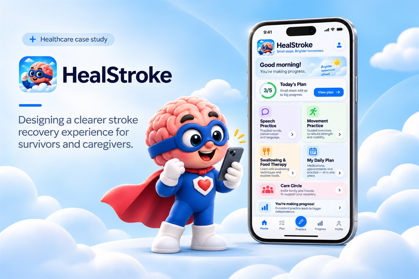
HealStroke reached Google Play and the App Store. In the released interface, the home screen, daily plan, exercises, check-ins, swallowing guidance and care circle all sit inside a single product.
The daily view connects recovery with speech practice, movement, swallowing and meal support, check-ins, and the people helping with care. What began as eight separate problems could finally be approached through one place — and the experience no longer asks anyone to choose a product before they can get help.
The final HealStroke experience
Home, daily plan, speech practice, check-ins, care circle and food guidance in the released app. Pause the motion, or select any screen to enlarge it.
I wanted the next family to open the app and understand where to begin, without first learning the structure of our company.